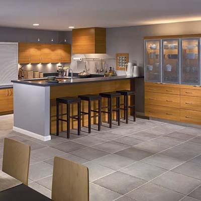
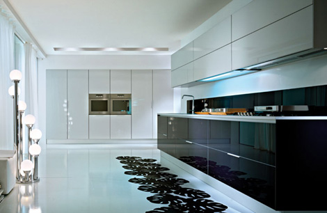
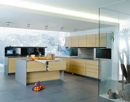
The room above works because of its mix of various materials with a neutral palette. I kept returning to beauty comma to look at it over several days. When you are drawn back to a room it is worthwhile to examine what aspects of it you like. That was easy for me in this case- everything.
Why does this room work in my view?
- blond woods are my favourite and have always been since I was in my twenties- no ebony or mahogony for me. I like my wood to integrate with the other elements in a room, not stand out. I like to use wood for its texture, not colour.
- clean lines allow your eyes to move over an object and on to something else.They create visual flow in a room which works to create a relaxing atmosphere. Boxy is better in my view because these lines seem to fit/follow the envelope of a room . Rectangular shapes can be softened by accessories and softer textiles.
- sculptural shapes are added in the lamp, vases, boxes and rock like structures in front of the window. There are other shapes hiding. Have a closer look. The selection of these accessories were not done in haste because they play perfectly with each other. This room depends on sculpture as an art form. Notice there are no two dimensional art pieces on the walls.
- variety in textiles (pattern, texture) is a must to support a mainly monochromatic room. The play of the striped rug against the furry one is wonderful.
- the absence of jarring colour makes this room a calm retreat. It is a room I could spend many hours in and still find it interesting because of the texture and shapes. Less is always more in colour.
- bringing the outdoors in by minimizing window treatments and utilizing the glimpses of nature as art.
It has many of the characteristics noted above but a much darker palette. Texture and sculptural forms are dominant.
Matt Costigan via Decoria
You have read this article texture
with the title June 2011. You can bookmark this page URL http://betweenbuildings.blogspot.com/2011/06/take-closer-look.html. Thanks!


