Dressing problem windows - 1

Not every window is perfectly sized  or perfectly placed, and when they aren't  it can be a challenge to decide on window treatments. This is the first of several posts on this topic.  If your window solution isn't here there's more to come.

Corner Windows 

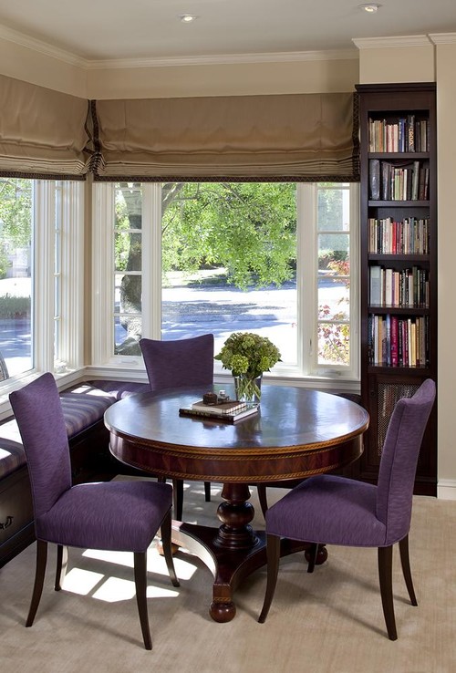
Dining Room eclectic dining room
Tracery Interiors

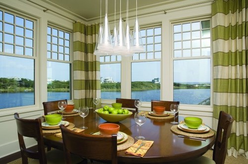
While corner windows are fantastic for views they often cause problems depending on how they meet in the corner.  This setting allows enough space for panels  to hang on the sides and in the centre, but they do not appear to be fully closing.  
 
Lindy Donnelly traditional living room

Roman shades are a good alternative in corner windows if there is enough room for the shades to meet in the corner. An inside mount would alleviate that problem.


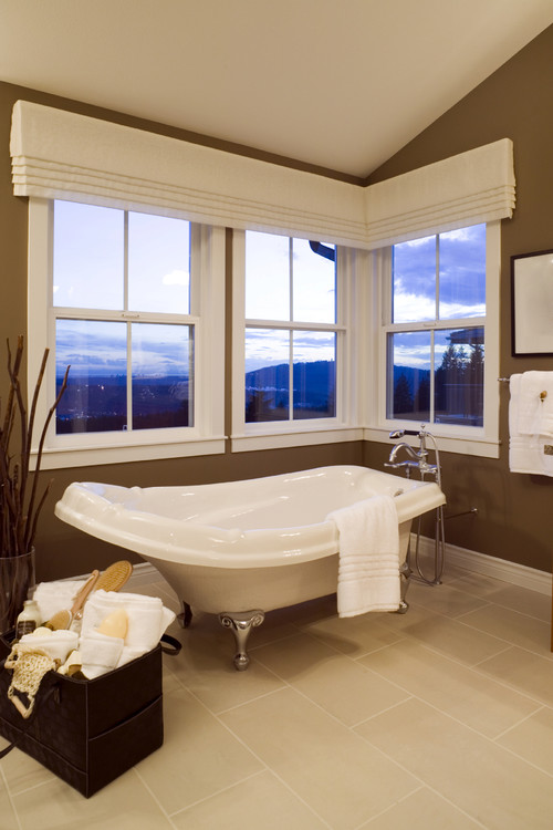
Beautiful Bathroom Remodel contemporary bathroom

If privacy isn't an issue you can keep is simple with a mock roman valance that runs the width of the two windows.

Two different style windows in same room
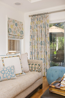
San Carlos Residence Two contemporary family room

When you  have two different style windows in a room one solution is to put a roman shade on the smallest one.  You can use the same fabric to coordinate the look.

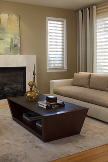
Living Room contemporary living room

If you have a layered treatment on the large window you can use the interior solution (blind, roman shade etc. ) on the smaller window. 

 High, small  basement windows


 When a window is set high in a wall it is difficult to know what to do with it.  My approach is to blend it into the wall rather than make it an accent.  That means keeping what you add as a treatment close in colour and value to the walls.  One of the simplest solutions is to use small tension rods and make a fitted curtain from translucent material .  In that way they can stay in place and still create some privacy.  Another option is faux wood blinds or sheer weave roller blinds that stay down.

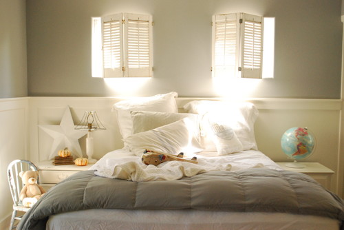
Dustins Bedroom traditional kids

 Shutters always work well in a basement because they can be easily opened and closed on a hinge which allows you to fold them back on the wall when you want optimum light. 


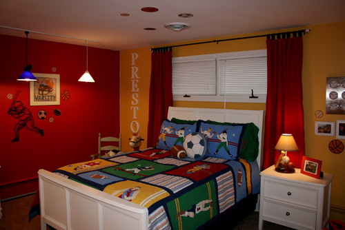
Boys Bedroom contemporary bedroom

Placing a bed below a basement window and then framing both with side panels  pulls a design together. Keeping the window treatment and the bed the same colour adds to the cohesiveness.


Privacy Issues

Elle Decor

Window film  is a practical solution when privacy is an issue in window treatments.  Some have patterns others are matte. When you buy large sheets of matte film it can be cut to create various geometric designs which add a little creativity to the solution.  This pattern is by Emma Jeffs.


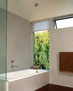
Cary Bernstein Architect Choy 1 Residence modern bathroom
Cary Bernstein Architect

One of my favourite window treatments for bathrooms and kitchens  is a roller shade.  They have a clean, no nonsense look, are easy to raise up and down and come in a wide variety of  patterns, textures and colours. If you want to see the view in the daytime they roll up completely under the cassette/valance.   

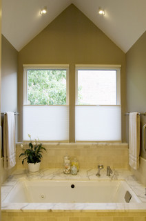
Ukrainian Village Master Bath contemporary bathroom
Claudia Martin, ASID

Top down bottom up cellular shades are very versatile and solve many decorating problems.  They can be dropped from the top or pulled up from the bottom. You can have privacy and light at the same time.   Check out Levelor.  
You have read this article window treatments with the title May 2011. You can bookmark this page URL http://betweenbuildings.blogspot.com/2011/05/dressing-problem-windows-1.html. Thanks!

Kitchen Countertop Photo Ideas


You have read this article Kitchen with the title May 2011. You can bookmark this page URL http://betweenbuildings.blogspot.com/2011/05/kitchen-countertop-photo-ideas.html. Thanks!

Kitchen Cabinet Design Photo Ideas


You have read this article Kitchen with the title May 2011. You can bookmark this page URL http://betweenbuildings.blogspot.com/2011/05/kitchen-cabinet-design-photo-ideas.html. Thanks!

Displaying family photographs-2

Continuing with ideas for displaying family photographs...

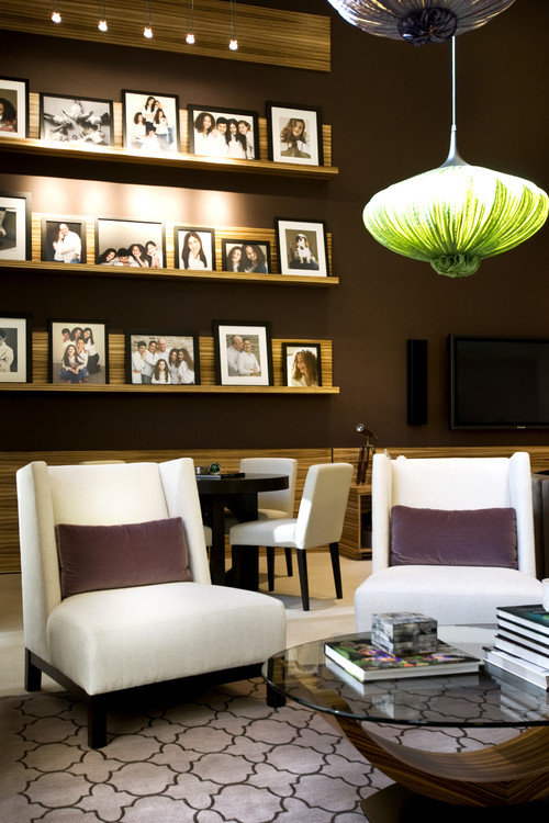
Use a photo ledge

NJ Residential contemporary living room

 CrystalTech - [ Roger Hirsch Architect ] eclectic living room
 Roger Hirsch Architect

I like the photo ledge, but I love the sofa/chair. 


 Make them part of a larger arrangement


source

How fresh the white and black photos look on the blue green wall. The tall tree like plant adds to the overall arrangement, however I find the photos a tad too close to the window trim.   


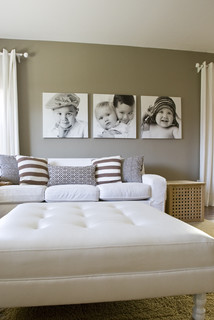
Print on large  canvases


 A grouping of squares always hang nicely together- much more interesting to my eye than rectangles.


Display without frames


source


source 

These frameless photographs are mounted on sturdy art boards and linked by small tape hinges  to create an accordion structure. This project displays well on a mantle, bookcase etc.

Memories traditional living room

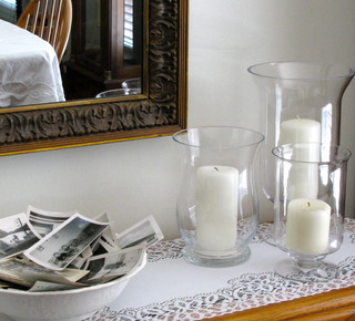
Don't these photos just beg to be handled/sorted/ looked at?  The crispness of the hurricanes and white cloths are a great juxtaposition with the untidy, "I just landed here" look of the photos.
You have read this article art arrangement with the title May 2011. You can bookmark this page URL http://betweenbuildings.blogspot.com/2011/05/displaying-family-photographs-2.html. Thanks!

Displaying family photographs - 1

We all have them, they keep increasing in number and often seem to get out of control. We could just keep them on the computer or in a box , but shouldn't someone else be able to see them?  Without thought you can easily end up with  every square inch of the tables and bookshelves in your house overrun with family photos. Perhaps these tips can make  photo display a little easier and  more polished.

Hang to create one unit


Using the same colour frames and hanging them so they touch gives the impression of one large unit.  When we want to join anything well in our house the answer is always 'Liquid Nails'  construction adhesive.  Including coloured papers in tones that work with the images  provides a resting place for the eye, highlights the photos, and creates colour cohesiveness.  Put some thought into where you place the colours and also keep arranging  the photos until you have a pleasant composition. If you have access to Ikea frames they work very well for this type of project.

source 

What a great idea for a headboard.  I also like the fact that it keeps the photos in a private part of the house.

Use one type or colour  of frame to unify collections

 source 

 Nothing looks as sharp as black and white photographs displayed in a grouping.  While the sizes and thicknesses of frames vary, the colour provides cohesiveness. The overall rectangular shape formed by the frames adds a professional look of the grouping.

 
source

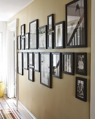
While this may look like a more haphazard arrangement on first glance, a closer look reveals order. 


Hanging Picture contemporary hall

This set up is more visually ordered. Lining up the bottoms and tops of photographs  through the middle of an arrangement produces a strong graphic element that draws the eye. 

Dining Room contemporary dining room
Charlie & Co. Design

I guess you can tell which type of arrangements I like.  I seem to have quite a few examples of grids!

Group on a table or mantle

Fluegge Interior Design, Inc.


Do you have a favourite way to display family photos?
You have read this article art arrangement with the title May 2011. You can bookmark this page URL http://betweenbuildings.blogspot.com/2011/05/displaying-family-photographs-1.html. Thanks!

Decorating a dining table-2

Perk up your dining room table by making centerpieces  using  everyday materials from flowers to sand.  You are only limited by your imagination. Perhaps you have a special occasion or a  themed dinner party, perhaps you just want a lift in the middle of a spell of bad weather; whatever your reason you can adorn your dining table. Here are some of my favourite ideas  I've collected for various occasions.

 source 

This has all the markings of success for me.  It combines circular motifs, lime green plant and the sea.  Perfect! Put  the stem of the plant in a tall water glass and fill in around it with silica and shells.

 source

Forget the trifle and fill your bowl with shells and water and float candles on top.  


A little red spray paint and birds from the dollar store adorn this white and red table setting.You could spray the branch any colour to match your decor. 


Float flowers with stems removed in water that has been tinted with food colouring. You can colour coordinate your themes with little effort. 


Beach rocks, orchids and floating candles in water in three vases of varying heights looks smashing .  Quick and very easy.  Substitute orchids with , roses, peonies  and change the candle colours to match. My preference is always  white . 


 Cut chunks of lemons or limes, keep some whole and float in a covered container.  This is a great touch for a brunch.Of course finding interestingly shaped jars is the challenge.


Tulips and jellybeans are perfect for an Easter centerpiece. While I love the look of this the logistics of it are confusing me.  I guess you don't eat the jelly beans after -this would not be a great choice with kids around.


How Martha to use simple white paper lunch bags to enclose glass vases giving  this floral arrangement a playful twist. 


 A mirrored tray is always a useful prop for table centerpieces.  Candles, mirror and flowers always pair up well.


The yellow flowers are paper and you can learn how to make them by clicking on the source above.


source

Reuse is always a good beginning to any design.  I'd skip the bedding of greenery and just use the starkness of the bottle shapes.  Think about those beautiful blue bottles used for some white wines with white callas. For a more informal and less expensive approach use daisies. It's the massing of different heights and shapes while keeping the colour constant that makes this design work.


Partly core a green apple and presto, you have a table arrangement. Check out other ideas on this site.


Anything can be used to make an arrangement as I frequently prove at my summer house.  As fall approaches there are no flowers left in the garden or meadow so I resort to greenery and buds from the nearby woods.  

 
source

And what about that china you never use?  Pile it up in interesting ways and add small scale flowers in appropriate colours to complete the arrangement. 


Save those interestingly designed tea cans, they have many uses. You don't need a large grouping like this one to create interest.


Check your cabinets.  Do you have a collection that never gets seen?  Arrange it along the centre of the table and use one of the containers as a vase.  Doesn't white always work?


I couldn't resist showing these.  The pom poms are styrofoam balls covered in shredded paper.  I've used shredded paper to build up textural layers in my art work , but I admit I never thought about using it in this way.   Adapt the idea and  make varying sizes of  "snowballs" to put in a large glass or silver bowl. 

Do you have a favourite?

You have read this article accessories with the title May 2011. You can bookmark this page URL http://betweenbuildings.blogspot.com/2011/05/decorating-dining-table-2.html. Thanks!